
Wood interiors 2026: material culture, not a fashion list
Fashion in wood moves faster than oil cures on a façade. In 2026 the point is not a “colour of the season” but material culture: how light reads a plane, how many species share one volume, and where trend ends.
Below is not a hashtag list but the working signs of a premium wood interior now — and what will still hold when the calendar turns.
We separate seasonal from manufactory: what you can try for a year or two, and what belongs in geometry and timber batch from day one.
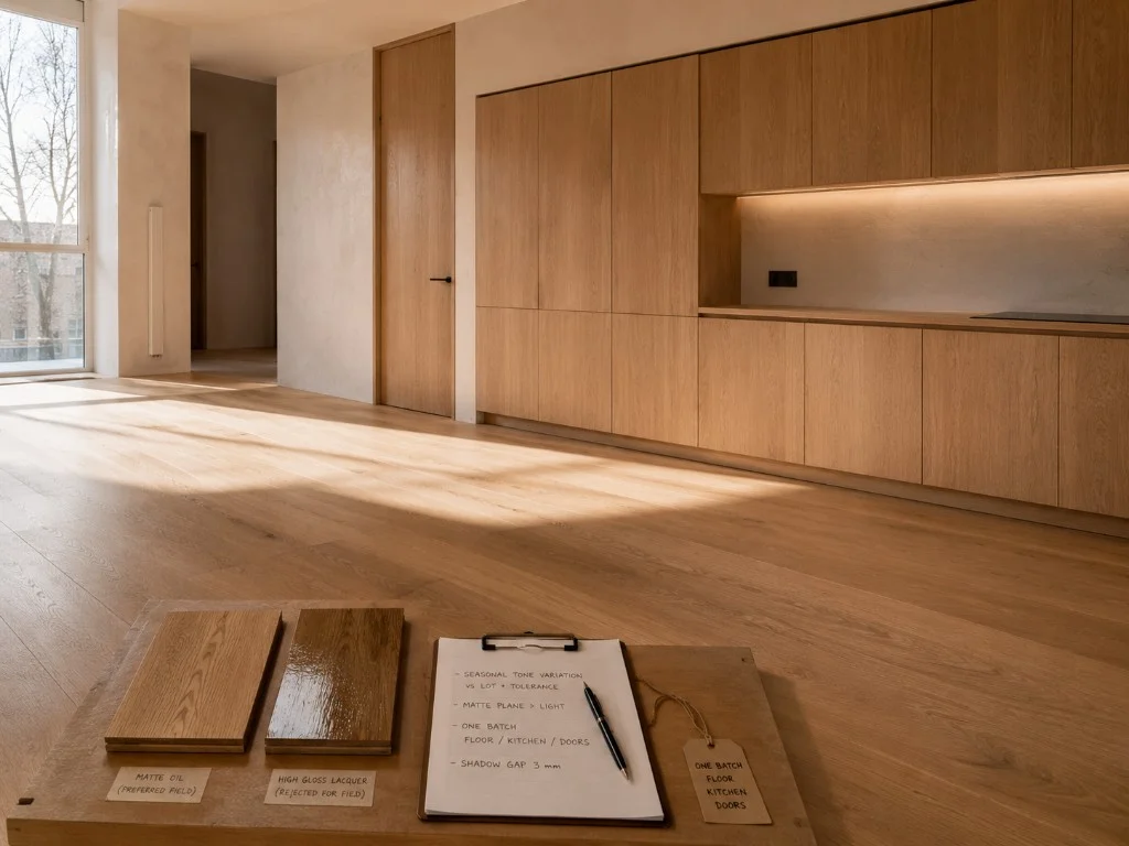
A wood trend is a language of surfaces and light, not a novelty catalogue. The client sees a “calm interior”; on site that means finish tone, field width, species contrast count and gap precision.
A fashionable gesture is easy to buy alone: another oil colour, heavy brushing “for age”, contrasting walnut against oak. Manufactory logic is different: one batch, fronts in one plane with floor and wall, joints that will not drift in three seasons.
In 2026 the market converges on monolithic wood planes and matte light. That is not a ban on ornament — it is a refusal of visual noise for readable architecture.
How does trend differ from manufactory logic?
Trend answers “how does it look now”. Manufactory answers “how will it live ten to fifteen years next to a window, a kitchen and seasonal humidity”.
Seasonal: a local species accent, brushing depth, a fashionable tone. Permanent: one-batch reserve for floor, fronts and doors; a matte finish that does not fight daylight; handle-light fronts flush with the wall; gaps drawn in the set, not improvised on site.
If you strip the year off a magazine cover, what remains is engineering: datum zero, one tone, install by method sheet. That is the line between “made it pretty” and “built an interior”.
Why does light win over “wood figure” in 2026?
Wood across a large field acts as a reflector: matte oil and a calm lacquer give a soft sheen; showroom gloss throws hard spots and a display-case feel.
Wide plank and façade formats read calmer than a fine rhythm. Grading without aggressive knot and sapwood contrast keeps the volume whole — the interior breathes rather than speckles.
Brushing and strong toning belong as accents. The main field is an even tone aligned with kitchen and fitted furniture in the same material logic.
Why fewer species contrasts?
Two or three species on one floor once sold “richness”. Now one base (oak or walnut) and at most one controlled accent is more common — otherwise the eye tires and joints expose different suppliers.
Fewer contrasts is not poverty — it is discipline. It is easier to hold a single batch: floor, fronts and doors age in sync, without “two oaks” at the worktop.
If an accent is needed — lock it in the project: zone, area, finish. A random contrast from catalogue leftovers looks cheaper in five years than an honest monochrome.
Why handle-light fronts and shadow gaps sit at the centre again?
Fronts without protruding handles and a thin shadow gap (about 3 mm as a guide) remove visual noise: wall and storage read as one plane. That is the 2026 language — and an old joinery idea of furniture as architecture.
Without precise carcass geometry the gesture breaks: wandering gaps and twisted doors show more than any fashionable handle. So the trend is inseparable from installation: laser datum zero, soft-close hardware, coplanar fronts.
Kitchen and wardrobe in this logic are one storage system — not modules from different suppliers with different radii and hardware.
What of “2026 trends” will outlast the season?
What remains does not depend on a cover: a matte field under daylight, monolithic planes, few species contrasts, fronts flush with the wall, gaps in the drawing, one timber batch for linked elements.
What fades or softens is easy to repaint and re-veneer: an extreme seasonal tone, fashion for maximum brush, decorative contrast for the photo.
A practical test: remove the word “2026” from the brief — if the interior still stands on geometry and material, you are in manufactory territory. If it stands only on a buzzword, it is décor for one renovation cycle.
How do you lock this into the object, not the deck?
At the start we fix species and field grading, finish (oil / lacquer), accent count, front and gap principle, and the floor–kitchen–door link. Then production and install — not “we’ll match it on site”.
Junctions with stone, metal and glass get compensation from the start — no steps at interfaces. Light and room axes matter more than decorative overlays.
Catalogue map: parquet, kitchens, furniture. Single-batch logic is a separate piece; install geometry is in the kitchen installation article.
In brief
What matters most in a wood interior in 2026?
How is a trend different from a lasting decision?
Is gloss needed in a premium residence?
Are handle-less fronts mandatory?
How many wood species suit one floor?
Where should a wood interior project start?
Need a site diagnosis — describe the floor or joinery.
Request a quote